Friday, 31 January 2014

EVALUATION QUESTION 3

3. What kind of media institutions might distribute your media product and why?

To identify a media institution that would be likely to distribute my product, I first identified a product which was similar to mine, in the form of 'WE <3 POP', which can be displayed below.


I have also looked at different ways of distributing my magazine in order to increase revenue and advertising of my magazine.


EVALUATION QUESTION 5

5. How did you attract/address your audience?

After producing my target audience research I had a better understanding of the lives and interests and what appeals them to a magazine. This allowed me to attract my audience in a number of ways, beneath is a prezi showing the different ways I have done this. 


Thursday, 30 January 2014

EVALUATION QUESTION 4

4. Who would be the audience for your media product?

To allow my magazine to attract and appeal to the target audience in which I will be marketing my magazine towards, I made sure to understand both their interests and their lifestyle in order to cater my magazine to be interesting and suitable for them.


I gave my sister some interview type questions about herself and my magazine in order to get some proof of the type of person to read my magazine, shown in the YouTube clip below.


Also, to show how I found out this information on my target audience I have made a presentation, shown below.


Saturday, 25 January 2014

EVALUATION QUESTION 2

2. How does your media product represent particular social groups? 


The social group I am most likely to be representing is white british in the category C1, however in my media product there are also dimensions of other things. I feel like it could be a very appealing magazine for other social groups.


Wednesday, 22 January 2014

EVALUATION QUESTION 1

1. In what ways does your media product use, develop or challenge forms and conventions of real media products?

In order for my magazine to be recognised as a pop/chart music magazine by my target audience, I have to follow 

To display which conventions I have used and which conventions I have challenged I have created three interactive presentations below on the website Prezi, for my front cover, contents page and double page spread.

Wednesday, 8 January 2014

Contents Page Changes


This is my final version of my contents page, I have made adjustments to the original like change the border of the original article image to pink instead or purple to fit with the colour scheme better, as was advised to do by the peer feedback, also I have changed the 'pg 23 and 24' on it, the font to white so it goes with the other page number at the bottom. I have also changed all the page numbers to pink instead of black to make them stand out and look more interesting to catch the readers eye. Also, I've added a page number to the top right hand corner.  

Tuesday, 7 January 2014

Front Cover Changes


CHANGES TO MY FRONT COVER
This is my final front cover now, I have change my main sell line to something shorted and added her name in, also I have made the bottom bar smaller so it looks more fitting to the magazine, I have also added a stroke through the font in the sell line so it's more visible.

What I have learnt about technology throughout the process of constructing this product

Throughout the process of constructing this product, I have used a number of programmes and material that I haven't necessarily used before, however now feel a lot more confident with all these programmes. 


In addition to this I created a blog account using “Blogger” to post all of my research and planning activities as well as my final magazine and evaluation, I hadn't used blogger before so it was a new programme for me using and have enjoyed using this to present my work instead of a hard copy of it. 


 To edit my photos and create my magazine, I used Adobe Photoshop CS5.1, this was also my first time using Photoshop and feel like I have learnt a lot about this programme in particular and will be using it again in the future.
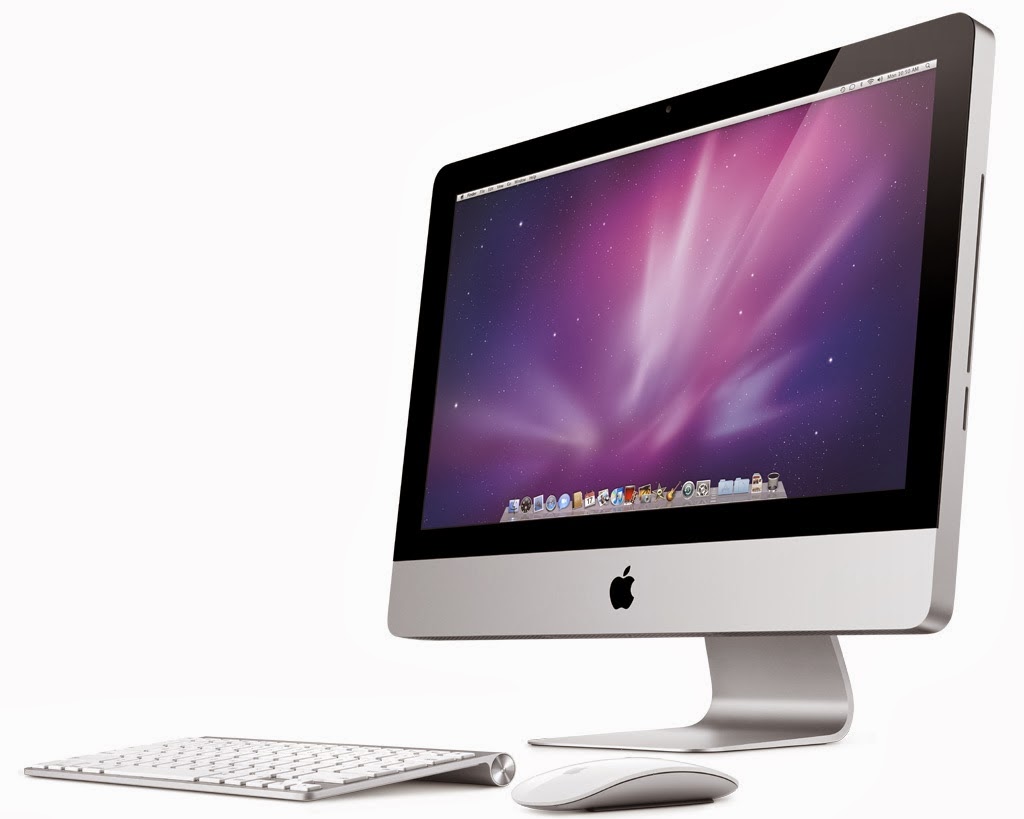
To create all my work, I have used a mac computer in college, also being my first time using one of these, I feel like I have got used to them pretty quickly, also at home I used my own laptop to complete some research and planning where extra work was needed to be done at home.


Also, to create my final pitch on my ideas for my magazine, I used prezi, this was to make a presentation type of pitch to collect all my ideas, this was also the first time using this and found it good and easy to use, and will use it again.


Although I didn't use my own camera to collect the original images for my magazine, I used a canon camera in college to collect the images for my preliminary task and to experiment with poses, this was the first time for my using a canon digital camera and also found it good to use.


Also, to create mood boards to help and collect my ideas I used 'www.fotor.com', and found this website at the beginning when looking for something to create a mood board and found this really good to use with quite simple features.


Thursday, 2 January 2014

Looking back at my Preliminary Task, what have I learnt and improved?

Since creating my college magazine my knowledge of using Photoshop has increased considerably, just by getting more comfortable with the software and finding new ways of editing and creating features on it. I feel like this shows in my work. Since the preliminary task I have learnt I learnt about male gaze and facial expressions by Marjorie Ferguson and Trevor Millun. As well as these I also learnt more on signs symbols and cultural differences, how simply a colour can have a deep meaning of something else for example the colour red resembles danger, this helped me choose an appropriate colour scheme for my magazine.


Firstly, on my front cover I feel like I've improved on for example, the main image the pose and quality of image has improved, which I feel looks more professional compared to the preliminary task where it was just taken my a phone camera.


On my contents page, I feel like my magazine looks better than my preliminary task in numerous ways, for example, having a contact us section at the bottom, I inserted this as I had looked at my inspirational magazines and this was definitely a popular feature of a contents page, especially in a pop magazine. Also, I have inserted a letter from the editor which was also an idea I thought of once looking at inspiration as it connects the audience with the editor more, and gives a 'friendly' impression to the magazine

Wednesday, 1 January 2014

Brand Identity

This shows my brand identity throughout my front cover, contents page and double page spread. Throughout the process of creating them I have done similar things and added similar things so they go together. For instance my colour scheme is mainly pink and white with the same on each page, this helps my stick to my genre and reflects on my target audience. By creating a brand identity it helps the readers for example when buying a magazine in a shop it's easily recognisable.