
Saturday, 21 December 2013
UPDATE
For the last week, at college it's a booster week where we have time to look at our peer feedback, make changes to our front cover, contents page and double page spread and also complete any research and planning that needs to be finished
Thursday, 19 December 2013
DOUBLE PAGE SPREAD IMPROVEMENTS

After looking back at my magazine I realised my article columns weren't in line, I have moved the article column up so both columns are in line making them look more professional.
Also, the reason my fact file does have gap in between them as if it was together, it would look too together and squashed, as shown below.

Wednesday, 18 December 2013
Double Page Spread Feedback
Again, our class collected Peer Feedback on our double page spread
Positive
- Looks very professional
- Font and colours match magazines theme
- Matches genre really well
- Great fonts
- Brand identity well maintained
- Fact File was a great idea
Negative/Improvements
- Maybe have a background? Not having one makes it look unfinished
- Possibly add a secondary images but it's not necessary
- Bar code could be moved
- Could make the 'Kate Marrs' bigger
- Less white

Tuesday, 10 December 2013
Contents Page Feedback
We've collected peer feedback in the class again where we put our work on the screens and ask for feedback both positive and negative on the work. This will help us in our work as it'll help us make improvements to it.
Positive
- Sticks to brand identity well
- I like the idea of the concert image
- The layout looks great, very professional
Negative
- Image of the editor could be included
- Page numbers look a little lost, you could change the colours
- The border should be changes from purple to pink
Positive
- Sticks to brand identity well
- I like the idea of the concert image
- The layout looks great, very professional
Negative
- Image of the editor could be included
- Page numbers look a little lost, you could change the colours
- The border should be changes from purple to pink
Monday, 9 December 2013

Sunday, 8 December 2013
Rationale - Contents Page
Main Image
My main image is not going to be too big, the same size as the secondary image, it's going to be of my model playing the guitar with a page number on it
Secondary Images
I'm going to have one secondary image, a concert image that I took of One Direction, this links well with my puff and has a page number of the page which my audience can win tickets.
Background
My background is going to be white, simple and similar to the front cover and dps, to create a brand identity. Also to keep the contents page simple and not too look to over crowded apart from the features.
Font
I'm going to use a font I have downloaded called 'cheri' this is a very girly font and fits very well with my target audience, being mainly girls. This is also the same font used on the masthead and the front cover sell lines to show the similarity in the brand identity.
Other
-Along the bottom I'm going to have a section dedicated to social media, giving our audience other ways of seeing bits about the magazine and getting special offers/ways of contacting us through social media with links to Facebook, Twitter and Instagram (the most used social media by teenagers as I found in my target audience research)
-I'm also going to include a letter from the editor in between the images to make it more of a personal magazine, this is also something other magazine in the pop industry does to connect to their readers on a more indepth level
-I'm going to have four sections to my block of 'contents' information to split it up and look more professional and to split the information up to attract the readers eye, these will be exclusive, features, gossip and plus, this is also something other magazines do.
Monday, 2 December 2013
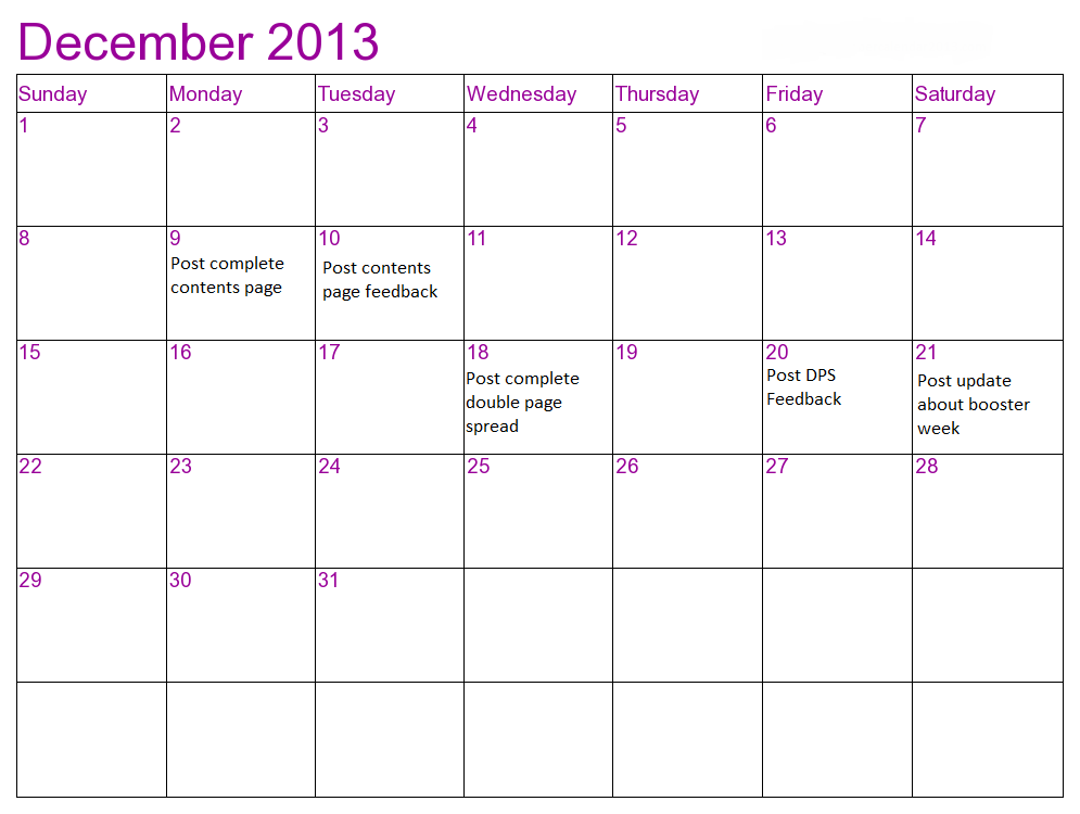
December Time Management
I have created another schedule for this month in order to keep on top of my work and make sure I get things done by a certain time, often giving me enough time to make adjustments also.
Subscribe to:
Comments (Atom)